The Challenge
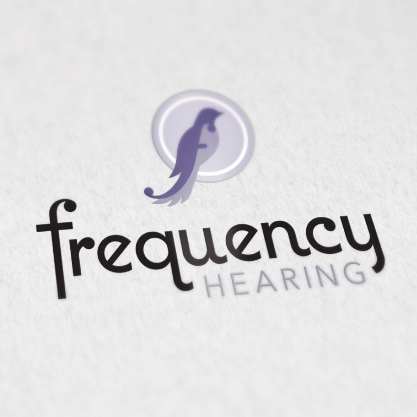
Frequency Hearing is a new hearing clinic opening in Beaumont, Alberta. When Frequency Hearing approached nine10, they had various ideas of symbolism to include in the logo. They wanted a logo that both represented the company and the values and personality of the owner. Once the logo was created we also designed basic stationery to be used in the clinic.
The Symbolism
Bird
The owner wanted to try and include some sort of bird in the logo. The reason behind this is because her child had a dream about wanting a bird as a pet and soon after they ended up with one. She explained this as a dream come true for her kid. When she was trying to think of symbolism for a logo her child told her to use a bird because it was like the dream of opening her own clinic was coming true.
Birds also symbolize music and singing which go hand & hand with hearing.
Frequency
The word frequency relates to sound waves and hearing. It also starts with an “F” which when stylized can become the musical notation for “forte” which means loud or strong. Both of these connect back to music and by extension sound & hearing.
Our Solutions
Because it was so important to incorporate the symbolism into the logo, nine10 went though two draft phases before selecting a final option to move towards. The final result incorporated both the bird and the forte dynamic together. The forte symbol is hidden inside the bird. It shows just under the head & beak and curls up in the tail feathers to add the last circular tail of the notation.

Also included in this logo are circles surrounding the bird icon. Circles often symbolize wholeness and integrity which is a representation of the the clinics care of patients and clients from start to finish or care that is ongoing. As well as representing a dream or wish coming true.
The colours chosen are meant to reinforce the soft personality of the company. Soothing purple tones to represent care & peace.

![]()
