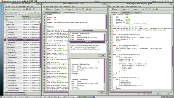
As programmers, we are constantly battling for the ever shrinking scraps of space we have to code in. Panels, windows, pop-ups, search bars, status bars… you name it. The clutter just keeps growing, all in the name of presenting as much information as humanly possible. Take a look at the next screen shot for a great example…

The typical cluttered IDE most programmers deal with
Light Table by Chris Granger introduces a new paradigm in IDE design. He started by stripping away everything but the bare essentials, allowing us to get back to the root of what we are really trying to accomplish. Nothing is left except what is required, functional, and beautiful. In the process, he’s not only managed to put the ‘art’ back into coding, but opened the door to some innovative interface concepts.
[vimeo]http://vimeo.com/40281991[/vimeo]
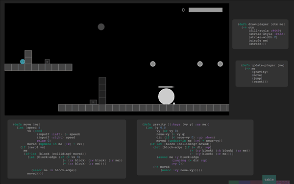
For example, take the view that has floating blocks of relevant code displayed around a running application. This allows you to see the various bits of code that interact and make the application work—all in one place, right here, right now:

Light Table’s innovative code panels bring everything up front in an uncluttered, productive way.
In a traditional IDE, this would be accomplished by compiling the application, leaving the IDE to view it, finding a bug, then stopping, flipping back to the IDE, finding files, opening them, scrolling around to find the code, making edits, running again, stopping… stab me in the eye now.
Flipping between tabs and scrolling to find code can get very tedious and time consuming when you have to do it at a high frequency… as is often the case with debugging. Chris’ design essentially eliminates these problems, making it very intuitive and fun to use. Wow, ‘fun’ in an IDE. Who would of thought?
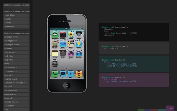
I’m really excited about Light Table, and so should some key players in the industry. Couldn’t you see Apple adopting this concept as the way to write XCode? Imagine developing iPhone apps this way! The small output area of a mobile app would lend itself very well to this interface.

Imagine the interface for mobile application development.
The IDE is one area of programming that has been stagnant for ages, and seeing Light Table made me realize just how much. Thanks Chris, for helping us break the mold.
Visit Chris Granger’s Blog for more screenshots and info about Light Table.


